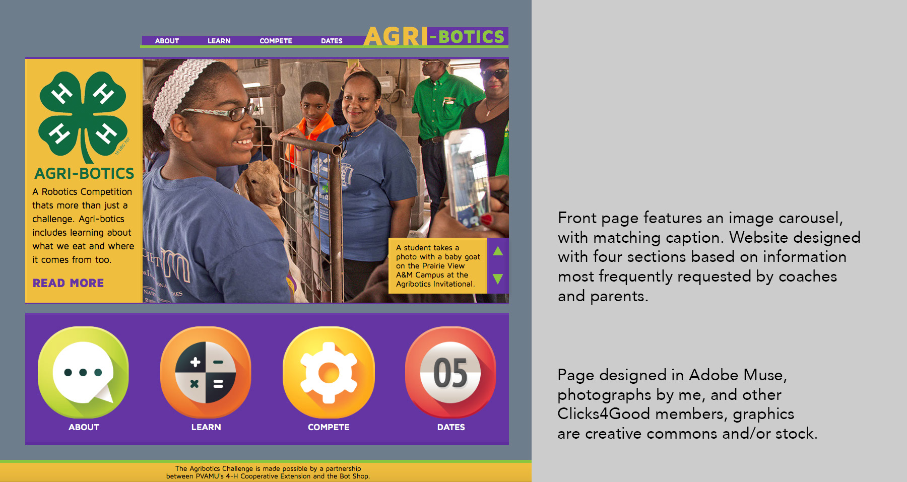

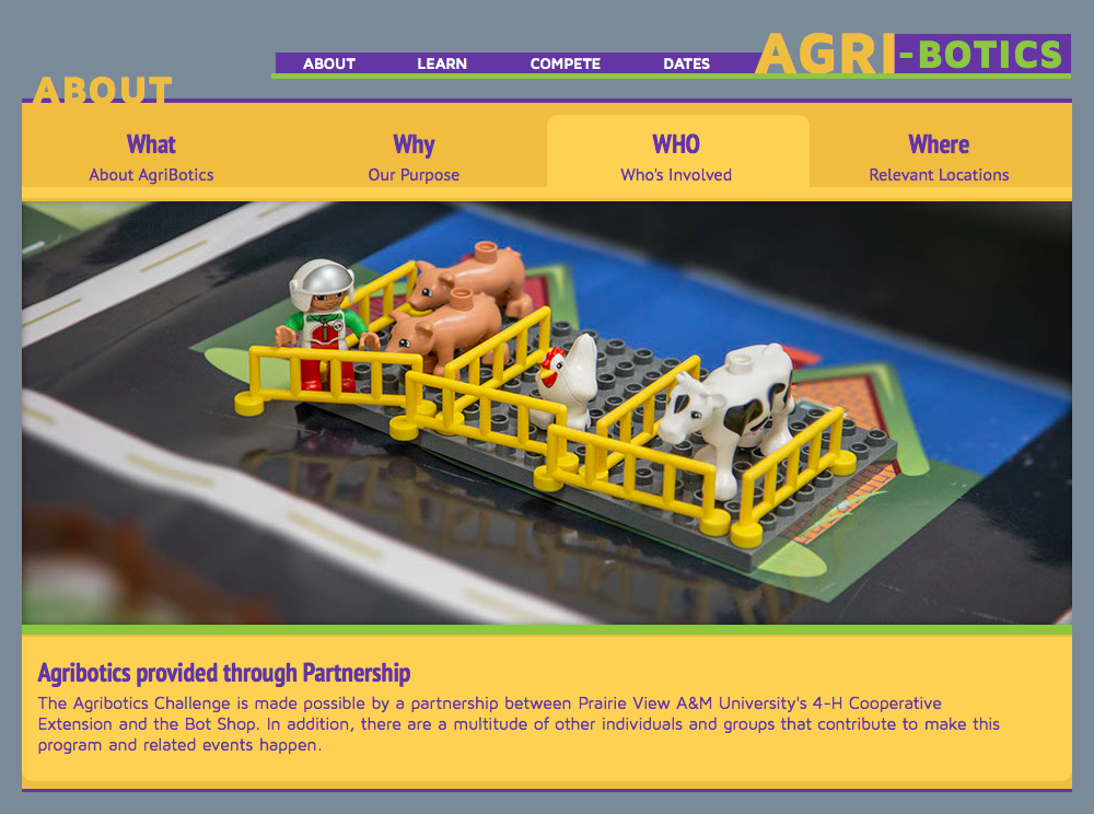
Primary design for the different sites sections are shown above. Within each section, content was divided across tabs, allowing a simple user friendly design that still allowed for a fair amount of content. Load time is relatively minimal, as design itself features almost no graphics- all through stylized div tags and type. The only graphics to load are the photos themselves, the 4H logo, and the four flat-ish icons on the front page.
Administration of the program changed hands, and as such the project was not released. All reviews of the project were favorable. All sections currently feature the same design, but there was intention for some variation in design based on content. Video content was planned for the Learn section- intended to teach teams both content about Robotics, but also about Agriculture and where they intersect. However, a mock-up was not created before the project changed hands.